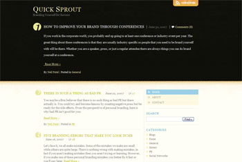
Like most designers, I’m never really finished with my own site, and I’ve been wanting to redesign this site for a while now. The old design served me well for 6 months or so, but it was time for a change. While I really appreciate busy sites that are chock full of visual goodness, I find sites that are simple and uncluttered to be the most appealing. Sites like these:
I tried several things on my test site, and just never hit on the right idea. Suddenly this afternoon, I had a burst of inspiration and voila, presto change-o! Being a person who gets tired of looking at the same colors all the time, I think I’ve hit on a setup that will allow me to change things regularly, while keeping the same basic look and feel. My intention is to regularly change the header and color scheme to give the site a fresh look. How regularly? I don’t know… whenever I get tired of it and find a new image that I like!
I decided to drop the bright blue and orange in my logo and go with a dark grey that will allow me to match the center piece with the color scheme as it changes. I know, I know… you’re not supposed to go changing your logo colors all the time because they are part of your brand, but I’m a firm believer that rules are made to be broken. Besides, I think my icon is a recognizable enough mark that it leaves some room to play with the colors.
What do you think about changing the colors in a logo? What would you change about this site if it were yours? How can I improve the design?
Do you need a new site design? Contact me for a quote!


